Quentrix - The Free Online Graph Calculator & Data Analysis Tool: Extract Data, Create Charts, Convert Units
Qentrix is a free, browser-based data visualization platform offering 20+ chart types, statistical analysis, and unique image-to-data extraction. A powerful alternative to expensive software, it requires no installation or registration. Perfect for students, researchers, and professionals needing instant, professional-grade data analysis tools.
FREE GRAPHING SOFTWARESTATISTICAL TOOLSSUBJECT MATTER EXPERT
Trendskope Team
10/12/20257 min read
In the world of scientific research, data analysis, and statistical computing, professionals have long relied on powerful desktop software like MATLAB, GraphPad Prism, Origin, and similar tools. These applications have set the standard for data visualization, statistical analysis, and graph creation for decades. However, they come with significant barriers: expensive licenses that can cost hundreds or even thousands of dollars, complex installation processes, steep learning curves, and the requirement to work from specific computers where the software is installed. For students on tight budgets, researchers with limited departmental funding, or professionals who need quick data analysis on the go, these barriers can be frustrating and limiting.
This is where the need for accessible, browser-based alternatives becomes clear. More and more users are searching for terms like "free alternative to MATLAB," "MATLAB alternative online," "free alternative to GraphPad Prism," and "online version of Origin." The demand is real: people need professional-grade data analysis tools that do not require breaking the bank or installing gigabytes of software. They want solutions that work instantly, from any device, without compromising on features or quality.
Introducing Qentrix: Professional Data Analysis in Your Browser
Qentrix is a comprehensive, free online data visualization and analysis platform designed to meet these exact needs. Whether you are a college student working on a chemistry lab report at 2 AM, a graduate researcher analyzing experimental results from a coffee shop, or a professional preparing a presentation while traveling, Qentrix brings powerful analytical capabilities right to your browser. No downloads, no installations, no expensive licenses. Just open your browser and start working with your data immediately.
Consider the case of Sarah Martinez, a biology student at a state university who was struggling with her enzyme kinetics project. She needed to analyze reaction rate data and create professional graphs for her research paper, but the campus computer lab with MATLAB was only open during limited hours. Using Qentrix from her laptop in the library, Sarah uploaded her CSV file containing substrate concentrations and reaction velocities, created a Michaelis-Menten curve with multiple Y-axes to compare different enzyme variants, and exported high-resolution images for her report. All within 30 minutes, completely free, without any software installation or complicated tutorials.
Advanced Graphing with 20+ Chart Types
At its core, Qentrix offers an impressive array of visualization options. With support for over 20 different chart types, you can create everything from basic scatter plots and line charts to sophisticated 3D surface plots, heatmaps, violin plots, and radar charts. Need to visualize distributions? Choose from histograms, box plots, or 2D histograms. Working with categorical data? Pie charts, donut charts, and waterfall charts are ready to go. The platform even supports specialized visualizations like contour plots, bubble charts, polar charts, and stacked area charts. All the tools you would expect from premium desktop software are available in your browser.
The diversity of chart types is essential for modern data analysis. Researchers in materials science can use 3D surface plots to visualize property gradients across sample surfaces. Environmental scientists can employ heatmaps to display spatial pollution patterns. Business analysts can create waterfall charts to show cumulative financial effects. Each chart type serves specific analytical needs, and Qentrix provides them all without requiring users to learn different software packages for different visualization needs.
Multiple Y-Axes for Complex Data Comparison
One standout feature is the support for multiple Y-axes on a single chart. This is crucial when you need to compare datasets with different scales or units. Imagine plotting temperature and pressure data on the same graph, or comparing sales figures with percentage growth rates. With Qentrix, you can add multiple Y-axes, position them on the left or right side of your chart, assign different colors to each series, and create publication-ready visualizations that clearly communicate complex relationships in your data. This level of control is typically found only in professional-grade software.
The ability to overlay multiple datasets with independent scales eliminates the need for normalizing data or creating separate graphs. Climate researchers can plot temperature, humidity, and wind speed on the same time axis. Physiologists can compare heart rate, blood pressure, and oxygen saturation simultaneously. This feature dramatically improves the interpretability of multivariate data and reveals correlations that might otherwise remain hidden in separate visualizations.
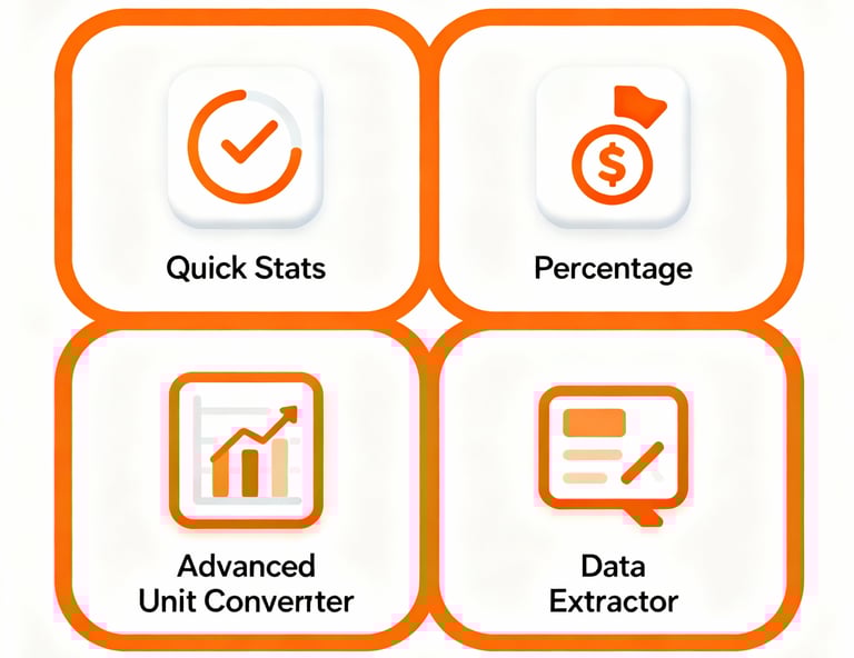
Data Extractor: Digitize Graphs from Images
Here is where Qentrix truly shines with a unique capability: the Data Point Extractor. Have you ever found the perfect graph in a research paper, textbook, or report, but could not access the raw data? Qentrix solves this problem elegantly. Simply upload an image of any graph, calibrate the axes either by clicking reference points or entering values manually, and then extract data points either manually by clicking or automatically using intelligent detection algorithms. The tool converts pixel coordinates into actual data values, which you can then export as a clean CSV file for further analysis. This feature alone can save researchers countless hours of manual data entry and makes it possible to build upon published research in ways that were previously tedious or impractical.
The data extraction capability addresses a longstanding challenge in scientific research. Often, older publications or patents contain valuable datasets that are only available as printed graphs. Manual digitization is error-prone and time-consuming. Qentrix automates this process while maintaining high accuracy. The calibration system accounts for different axis scales, logarithmic plots, and even distorted images. Both manual and automatic extraction modes ensure that users can choose between precision control and rapid batch processing depending on their specific needs.
Comprehensive Statistical Tools
Beyond visualization, Qentrix includes a full suite of statistical calculators. The Quick Stats Calculator computes mean, median, standard deviation, variance, range, and other essential statistics from any dataset you provide. The Percentage Calculator handles multiple operations including finding percentages, calculating what percentage one value is of another, and performing other common percentage computations that come up in everyday analysis. These tools are perfect for quick calculations during lectures, lab work, or business analysis.
Statistical analysis forms the foundation of data-driven decision making. Students learning statistics can verify their manual calculations instantly. Quality control engineers can rapidly assess whether measurements fall within acceptable tolerances. Financial analysts can compute percentage changes and growth rates without switching between applications. The integration of statistical tools within the same interface as visualization capabilities streamlines the analytical workflow and reduces the cognitive load of managing multiple software packages.
Practical Unit Converter
Need to convert measurements on the fly? Qentrix's built-in Unit Converter handles length, weight, temperature, area, volume, and speed conversions across multiple unit systems. Convert meters to feet, kilograms to pounds, Celsius to Fahrenheit, or any other common conversion instantly. This is particularly useful when working with international datasets or when your data comes in mixed units. The converter supports all commonly used units in scientific, engineering, and everyday contexts, eliminating the need for external conversion tools or manual calculations that introduce potential errors.
Seamless Data Import
Working with data is effortless. Upload CSV files or Excel spreadsheets in both .xlsx and .xls formats, and Qentrix automatically detects your columns and prepares them for visualization. The tool intelligently handles headers, deals with various data formats, and even works with files that have no header row by creating default column names. Once loaded, you can immediately start creating charts, performing statistical analysis, or extracting specific data subsets. The robust parsing engine handles edge cases like inconsistent delimiters, embedded commas in quoted fields, and mixed numeric formats, ensuring that your data imports correctly regardless of how it was originally formatted.
Professional Export Options
When it is time to share your work, Qentrix does not disappoint. Export your charts as high-resolution PNG images perfect for papers and presentations, vector-based SVG files ideal for further editing in design software, or interactive HTML files that allow others to explore your data dynamically. The PNG export uses 1920x1080 resolution with 2x scaling for crystal-clear output suitable for professional publications. Vector exports preserve every detail of your visualization, allowing for infinite scaling without quality loss. Interactive HTML exports embed the full plotting library, creating standalone files that recipients can open in any browser without requiring Qentrix access.
Customization and Theming
Tailor your visualizations to match your needs. Choose between light and dark themes for different presentation contexts or personal preferences. Adjust marker sizes and line widths to emphasize specific data features or match journal requirements. Enable or disable gridlines and legends to maximize data-ink ratio or provide necessary context. Apply logarithmic scales to axes for data spanning multiple orders of magnitude. Add custom titles and labels to make your charts self-explanatory. Every chart can be fine-tuned to meet specific style requirements, whether you are following journal guidelines, corporate branding standards, or creating materials for classroom instruction.
The theming system extends beyond simple color changes. Dark themes reduce eye strain during extended analysis sessions and are preferred for presentations in dimly lit rooms. The ability to control every visual aspect ensures that outputs meet the diverse requirements of academic journals, conference proceedings, patent applications, and business reports. Users can save time by configuring their preferences once rather than manually adjusting every chart.
Accessible, Free, and Always Available
Perhaps most importantly, Qentrix is completely free with no registration required. There are no premium tiers, no feature limitations, no watermarks, and no hidden costs. The platform works on any modern device including desktop computers, laptops, tablets, and smartphones, making professional data analysis truly accessible to everyone, everywhere. Whether you are a high school student learning statistics, a PhD candidate analyzing dissertation data, or a seasoned professional, Qentrix provides the tools you need without barriers.
The commitment to accessibility extends beyond removing financial barriers. The web-based architecture means that users can switch seamlessly between devices. Start an analysis on your desktop, review results on your tablet during a commute, and make final adjustments on a laptop before a presentation. No synchronization issues, no file transfers, no compatibility problems. The democratic approach to scientific software empowers researchers in developing countries, independent scientists without institutional affiliations, and anyone who believes that powerful analytical tools should not be restricted to those with expensive software budgets.
Start visualizing and analyzing your data today. No credit card, no sign-up, just pure analytical power at your fingertips. Whether you need to extract data from published graphs, create complex multi-axis visualizations, perform rapid statistical calculations, or simply convert units between systems, Qentrix delivers professional-grade functionality through an interface designed for efficiency and ease of use. Join thousands of students, researchers, and professionals who have discovered that sophisticated data analysis does not require sophisticated software investments.
Connect
Stay updated with curated trends and resources.
Contact
© 2025. All rights reserved.